Visual look

Welcome to explore HSY’s look.
Here you will find general guidelines, colour specifications, the logo with instructions for use, and instructions for worksite signs.
The materials are custom-designed under the leadership of communications, so there are no other instructions or design templates in public distribution.
Logo
Logo usage only allowed by permission of HSY.
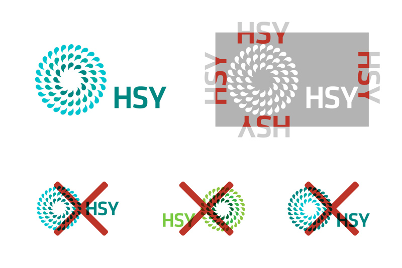
HSY’s company logo consists of two parts: a logotype (the letter combination “HSY”) and a mark (design).
The logo should always be treated as a single entity, and the locations, colours or proportions of the parts must not be changed. In addition to the version downloadable from this page, there are variations of the logo for, among other things, web services and outdoor flags: for the sake of clarity, those versions are not presented in these instructions.
There are three colour versions in use:
- tricolour
- black
- white
Protected area
The protected area simply means how much empty space there must be around the logo at a minimum.
Always leave as much space around the logo as possible and at least half the height of the logotype (letter combination “HSY”).
Downloadable logos
Graphic instructions
These instructions have primarily been compiled for HSY staff. Even though the principles of the look are the same in all activities, more demanding implementations are always designed in cooperation with communications.
Colours
Clarity is one of the cornerstones of HSY’s look. Therefore, try to use a single dominant colour. If you need supporting colours for graphs, maps or highlights, keep them in a clearly smaller role compared to the main colour.
HSY’s main colour is turquoise. More specifically, three shades of bluish-green have been specified: light, medium, and dark. If necessary, so-called “tints” of these can also be used, i.e. the colours can be lightened by percentage.
Black and white, as well as their “tints”, i.e. pure shades of grey, are also used by HSY as main colours.
Fonts
Efforts have been made to have font types ready in the templates. So, whether you are using web-based services, the intranet or Office software, the paragraph styles and fonts have been pre-installed – just use the tools as instructed. NB! Please always use the ready-made styles (heading, subheading, body text, caption, etc.), as this supports the accessibility of the materials.
Why use different fonts?
The Interstate font family specified for HSY from the outset requires a user-specific licence, so this font is not installed on every workstation. The HSY.fi website uses Interstate covered by the licence. Interstate is also used in access signs, brochures and other materials, regarding which you can contact the communications unit.
Primary fonts
- Interstate (and Interstate Plus): professional graphic design use and HSY.fi
- Adobe Source Sans Pro: web services, excluding HSY.fi
- Arial and Calibri: Office software
These fonts cover 99% of HSY’s needs. In addition, typography and fonts are used more freely in campaigns, etc. run by communications, if necessary.
Guidelines for design
All HSY materials, whether electronic or physical, have the same design principles. In line with the legacy of Scandinavian minimalism, the goal is strong and clear visual communication. The new accessibility requirements further support this policy.
Using elements, colours and pictures
- use only two colours whenever possible: for example, white text on a dark-coloured background
- use supporting colours, such as for graphs, carefully and in a clearly subordinate role to the chosen dominant colour
- add more life with (colour) photos
- in graphics, aim for simple shapes: no overly fine details
exclude frames whenever possible
forego shading, bulging and other effects
Utilising fonts
- as few different text sizes as possible
- only a few variants (italics, bold, CAPITALISATION, etc.)
- with bold text, skip one weight if the font allows it (regular, bold, black)
- clear background for text: no body text on top of a picture
- use a covering white or coloured box if you want to add some text on top of a large picture
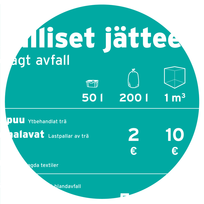
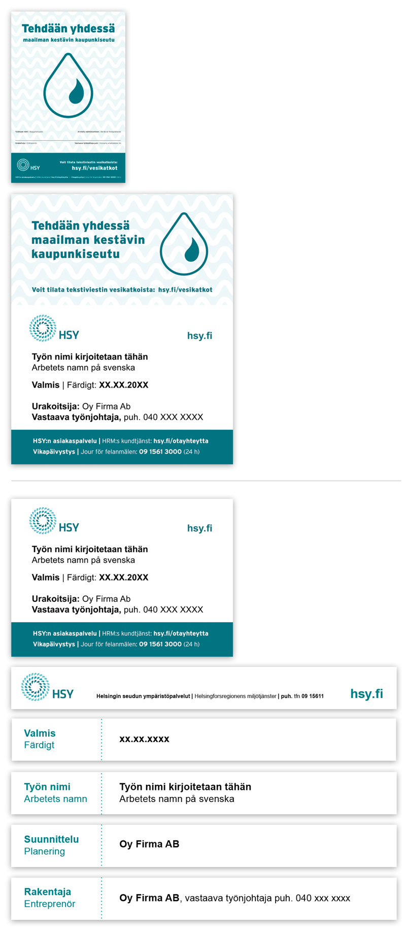
Worksite instructions and signs
Materials for contractors
Here you will find the print materials and instructions for HSY’s most commonly used worksite signs as PDF files.
The contractor is responsible, at its own expense, for the production and translation of the worksite sign texts in accordance with the instructions provided by HSY, for the acquisition and erection of the signs in the location indicated by the supervisor, and for the dismantling and removal of the signs.
There are two types of signs:
Signs for water services worksites
Network worksite sign instructions (PDF)
Worksite sign HSY small c-print (PDF)
Worksite sign large image section (PDF)
Worksite sign large logo section (PDF)
Worksite sign large bottom section (PDF)
General signs for other HSY worksites
Worksite sign 60 x 60 cm
Worksite sign 60 x 90 cm
Worksite sign 160 x 115 cm
Worksite sign 450 x 50 cm,five boards
Support colours
Pink 
| # | D8318A |
| RGB | 216, 49, 138 |
| CMYK | 10, 90, 0, 0 |
| PMS | 219 C |
Red 
| # | BD3429 |
| RGB | 189, 52, 41 |
| CMYK | 20, 90, 90, 0 |
| PMS | 1795 C |
Dark orange 
| # | BE4D00 |
| RGB | 190, 77, 0 |
| CMYK | 0, 70, 90, 10 |
| PMS | 718 C |
Orange 
| # | EA7600 |
| RGB | 234, 118, 0 |
| CMYK | 0, 55, 85, 0 |
| PMS | 716 C |
| RAL | 2000 |
Yellow 
| # | F9D800 |
| RGB | 249, 216, 0 |
| CMYK | 5, 10, 100, 0 |
| PMS | 108 C |
Brown 
| # | 4E3629 |
| RGB | 78, 54, 41 |
| CMYK | 70, 80, 90, 0 |
| PMS | 476 C |
Dark green 
| # | 006431 |
| RGB | 0, 100, 49 |
| CMYK | 100, 50, 100, 0 |
| PMS | 357 C |
Medium green 
| # | 009F4D |
| RGB | 0, 159, 77 |
| CMYK | 90, 0, 93, 0 |
| PMS | 7482 C |
Light green 
| # | 74AA50 |
| RGB | 116, 170, 80 |
| CMYK | 55, 5, 85, 0 |
| PMS | 7489 C |
Purple 
| # | 814494 |
| RGB | 129, 68, 148 |
| CMYK | 60, 82, 0, 0 |
| PMS | 520 C |
Dark blue 
| # | 006AA7 |
| RGB | 0, 106, 167 |
| CMYK | 100, 50, 10, 0 |
| PMS | 3015 C |
Light blue 
| # | 9BCBEB |
| RGB | 155, 203, 235 |
| CMYK | 40, 5, 5, 0 |
| PMS | 291 C |